


Dealing with Frankenstein’s Monster aka. your website
Have you ever opened your website in your browser and thought “Wow – this really doesn’t reflect our business anymore!” I hear you! Your business might have changed dramatically since you first launched your website, or perhaps it’s become an absolute beast behind the scenes – like Frankenstein in a ball gown – slowly coming apart at the seams.
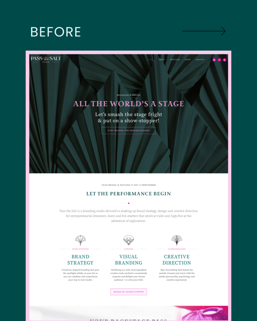
A website that’s reached its expiry date not only takes our confidence as business owners down a notch (or several), it can also be off-putting and confusing for visitors to our site. You may well be wasting valuable time and energy on something that’s no longer serving you or your clients. Here at Pass the Salt, we wrestled with this behind the scenes for years. Simply giving our current site another makeover wasn’t going to cut it anymore. It had to go! Here we give you the low-down on why we made the move to a whole new site.
Why we made the move to a new online home
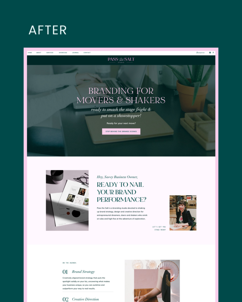
Our old website was getting as outdated as an oversized mobile flip phone clipped to our belt. Clunky and unwieldy – it’s upkeep was stealing far more of the lime-light in our business than it should have been. So, we decided it was time for a major makeover. We wanted a website that would not only scream “scroll-worthy!” and dazzle our audience but we also wanted to create an experience that would make our audience feel like they’re invited to become part of our story and to journey on our next adventure together. We want to spend our valuable resources making our clients shine, rather than holding together our website with sticky tape!
When we began investigating options, we asked ourselves what was truly going to support the growth of our business and allow us to better serve our cilents? We needed something beautiful, strategic, easy to customise and low maintenance. Dreaming of a confidence inducing website that didn’t feel like it was being held together with sticky tape and create heart palpitations, awaiting the next dramatic exit stage right.
Why we chose Showit + TONIC
When looking around at platform options, we were on the hunt for something with creative flexibility that made up-keep a cinch. We’d been itching to try the Showit platform on for size for some time – being dazzled by the seeming ease and design flexibility. We also wanted a new website that would still feel feel connected, to express the journey that we’re on in our business development.
As designers, the pressure of creating for our own business is immense! We sometimes really need to get out of our own ways so that we can move the needle. This is why we decided to work with a template from one of our all time favourites – TONIC Site Shop. Their templates are absolutely drool-worthy and they had exactly the aesthetic we were after to compliment our business identity. We selected the Manhattan template – editorial, sleek, bold – and we were away – onward to a beautiful new home for our evolving business.
Speaking of evolution – the refreshed site is exactly that. We haven’t rebranded or changed our business. Our refreshed website reflects our evolving journey and remains connected to our core vision and values. I have to say, it’s wonderful to finally have a truly visual and intuitive platform to work with!
Taking it by the short and curlies: Why your online shopfront needs regular revamp
Alright people, listen up! Your website is like your virtual business card, your online shopfront, your digital home… and just like you wouldn’t hold a party in a room filled to the brim with crumbling objects and piles of old articles, you should leave your website in a sad, outdated and unravelling state either. It’s super important to keep that bad boy up to date, not just for aesthetics, but for functionality too. You want visitors to have an enjoyable experience on your site, and if it’s slow, glitchy, or straight up not working, you’ll send them packing faster than you can say “404 error”. Plus, if you’re not regularly updating your content, you’re missing out on opportunities to connect with your audience and potentially grow your business. So, let’s make a deal: you keep your website up to date, and I’ll keep my oh so witty remarks coming. Deal? Fab. Let’s shake on it!
Wrapping up: The (no.1) Takeaway from Our Website Refresh
In the classic horror story of Frankenstein, stitched together body parts were brought to life with lightning and a monster was born. We understand that taking on such a large endeavour can be daunting, because let’s be real, we’ve been there and at the end of the story Frankenstein’s monster is sadly destined for the flames. Our websites can become monsters over time, as a pieced together mess of clunky tech and needy plugins. It’s essential that we take regular action to keep them working for us. Not the other way around. When the time comes to decide which direction to take your website, make sure you choose what’s right for your business. We took the plunge and chose what was right for our business, enabling us to chart a new path forward. We breathe a sigh of relief when we check in and see it still has all of its moving parts intact. Phew!
Are you struggling with your own “Frankenstein’s monster”? Let us know in the comments!

Pass the Salt, founded by Elise Elliott, is a branding studio devoted to shaking up brand strategy, design and creative direction for entrepreneurial dreamers, doers and shakers who smirk at rules and high-five at the adventure of exploration.
Elise’s branding framework helps clients find language for their authentic business identity, connect with their dream audience and find greater ease in their business.
Dealing with Frankenstein’s Monster aka. your website
Have you ever opened your website in your browser and thought “Wow – this really doesn’t reflect our business anymore!” I hear you! Your business might have changed dramatically since you first launched your website, or perhaps it’s become an absolute beast behind the scenes – like Frankenstein in a ball gown – slowly coming apart at the seams.
A website that’s reached its expiry date not only takes our confidence as business owners down a notch (or several), it can also be off-putting and confusing for visitors to our site. You may well be wasting valuable time and energy on something that’s no longer serving you or your clients. Here at Pass the Salt, we wrestled with this behind the scenes for years. Simply giving our current site another makeover wasn’t going to cut it anymore. It had to go! Here we give you the low-down on why we made the move to a whole new site.
Why we made the move to a new online home
Our old website was getting as outdated as an oversized mobile flip phone clipped to our belt. Clunky and unwieldy – it’s upkeep was stealing far more of the lime-light in our business than it should have been. So, we decided it was time for a major makeover. We wanted a website that would not only scream “scroll-worthy!” and dazzle our audience but we also wanted to create an experience that would make our audience feel like they’re invited to become part of our story and to journey on our next adventure together. We want to spend our valuable resources making our clients shine, rather than holding together our website with sticky tape!
When we began investigating options, we asked ourselves what was truly going to support the growth of our business and allow us to better serve our cilents? We needed something beautiful, strategic, easy to customise and low maintenance. Dreaming of a confidence inducing website that didn’t feel like it was being held together with sticky tape and create heart palpitations, awaiting the next dramatic exit stage right.
Why we chose Showit + TONIC
When looking around at platform options, we were on the hunt for something with creative flexibility that made up-keep a cinch. We’d been itching to try the Showit platform on for size for some time – being dazzled by the seeming ease and design flexibility. We also wanted a new website that would still feel feel connected, to express the journey that we’re on in our business development.
As designers, the pressure of creating for our own business is immense! We sometimes really need to get out of our own ways so that we can move the needle. This is why we decided to work with a template from one of our all time favourites – TONIC Site Shop. Their templates are absolutely drool-worthy and they had exactly the aesthetic we were after to compliment our business identity. We selected the Manhattan template – editorial, sleek, bold – and we were away – onward to a beautiful new home for our evolving business.
Speaking of evolution – the refreshed site is exactly that. We haven’t rebranded or changed our business. Our refreshed website reflects our evolving journey and remains connected to our core vision and values. I have to say, it’s wonderful to finally have a truly visual and intuitive platform to work with!
Taking it by the short and curlies: Why your online shopfront needs regular revamp
Alright people, listen up! Your website is like your virtual business card, your online shopfront, your digital home… and just like you wouldn’t hold a party in a room filled to the brim with crumbling objects and piles of old articles, you should leave your website in a sad, outdated and unravelling state either. It’s super important to keep that bad boy up to date, not just for aesthetics, but for functionality too. You want visitors to have an enjoyable experience on your site, and if it’s slow, glitchy, or straight up not working, you’ll send them packing faster than you can say “404 error”. Plus, if you’re not regularly updating your content, you’re missing out on opportunities to connect with your audience and potentially grow your business. So, let’s make a deal: you keep your website up to date, and I’ll keep my oh so witty remarks coming. Deal? Fab. Let’s shake on it!
Wrapping up: The (no.1) Takeaway from Our Website Refresh
In the classic horror story of Frankenstein, stitched together body parts were brought to life with lightning and a monster was born. We understand that taking on such a large endeavour can be daunting, because let’s be real, we’ve been there and at the end of the story Frankenstein’s monster is sadly destined for the flames. Our websites can become monsters over time, as a pieced together mess of clunky tech and needy plugins. It’s essential that we take regular action to keep them working for us. Not the other way around. When the time comes to decide which direction to take your website, make sure you choose what’s right for your business. We took the plunge and chose what was right for our business, enabling us to chart a new path forward. We breathe a sigh of relief when we check in and see it still has all of its moving parts intact. Phew!
Are you struggling with your own “Frankenstein’s monster”? Let us know in the comments!
Pass the Salt, founded by Elise Elliott, is a branding studio devoted to shaking up brand strategy, design and creative direction for entrepreneurial dreamers, doers and shakers who smirk at rules and high-five at the adventure of exploration.
Elise’s branding framework helps clients find language for their authentic business identity, connect with their dream audience and find greater ease in their business.


Comments +